


Delving into Dots: Artist Barbara Kolo

Raised and educated in New York, Barbara Kolo was an award-winning art director in the city before she switched coasts to work in the film industry. She worked as a freelance art director before rising to director of print advertising at Universal Studios, all the while creating fine art on the side. However, it wasn’t until she and her husband temporarily moved to Paris in the early 2000s that her paintings evolved from a representational style to abstraction. This was the genesis of a prolific art career featuring several series of theme-based abstract paintings.
Tell us about your childhood. How did it mold you?
I grew up in New York City in the borough of Queens. It was very American postwar suburbia. I have fond memories of my neighborhood. When I was very young, all the children on the block would play together. In the summer, we played tag or softball on our street. In the winter, we had snowball fights, ice skated at the local lake, and went for sleigh rides. My friend’s family owned a stable, and she and I would go horseback riding on trails only a few blocks from my home. At that time, children had more freedom. I remember walking by myself a few blocks to the local store at six or seven years old. It made me a very independent person. Parents didn’t have the worries that they do now.
Did your parents encourage art when you were young?
I don’t remember my parents encouraging it. My drawings might have been proudly displayed, but it was not thought of as a career. My older sister and some of her friends had artistic talent. They would draw together, which was a big influence on me. I wanted to be able to draw as well as they did, and they would teach me. Another influence was my aunt, who had worked as a fashion illustrator.
What is the High School of Art and Design?
The High School of Art and Design is a technical education high school in Manhattan, and I spent part of my high-school years there. Their program focused on painting, illustration, sculpting,
commercial art, and theatrical design. Along with my application, I needed a letter of recommendation from an art teacher from junior high school and a portfolio of my artwork. The school day was longer than a regular high school’s because the art classes were in addition to the regular high-school program. The art classes offered there were specialized, with the aim of preparing students to work in the arts. Many graduates continued their art education in college. I went on to receive a bachelor of fine arts degree from the School of Visual Arts in Manhattan.
What was your first job after receiving your degree?
I worked as a production artist/junior designer at a graphic design studio. They had many different types of clients, but the jobs designing movie posters interested me the most. During the year and a half I worked there, a client accepted my first poster and logo for a movie campaign. This success was unusual for someone of my age, especially considering there was more than one design studio competing for the projects. I remember that my first logo, for a horror movie called Parasite, was going to appear on the famous Times Square sign every half hour to promote the movie. Being young and enthusiastic, I borrowed my brother-in-law’s camera and stood in the middle of Times Square at night, waiting until the logo appeared on the sign so I could snap photos. I still have the photos in storage somewhere in my house.
That early success gave my career immediate momentum. I eventually worked my way up to being a creative advertising art director for films and television.
What did you like about being a freelance art director?
Some of my most memorable days were art directing photo shoots for advertisements or film posters. I enjoyed the collaboration with he photographer and seeing my sketches come to life. I also loved researching a movie’s subject matter and becoming immersed in the story. Selling a movie is not like selling a can of peas. You become involved in the story, the characters, and, in some cases, the historical era of the film. Before I became director of print advertising at Universal Studios, I worked for the company as a freelance art director with similar responsibilities, which made the transition much easier.
How did you know it was time to retire from advertising and return to fine art? Was it sudden, or did you concurrently work in advertising while painting your own works?
I lived on deadlines for many years and had some stress-related health problems, but I didn’t make any sudden decisions. For five years, I worked on both my personal artwork and my freelance design jobs. My true turning point came when my husband and I moved to France. He was a designer at Walt Disney Imagineering, and we moved overseas so he could work on the design team for the second phase of their theme park outside of Paris. While there, I found the possibilities for art inspiration to be endless. When I went to the Louvre to draw, everything about the experience inspired me. I loved being in the Louvre—the architecture, my interaction with the people, the many languages spoken, the sense of history, and the art.
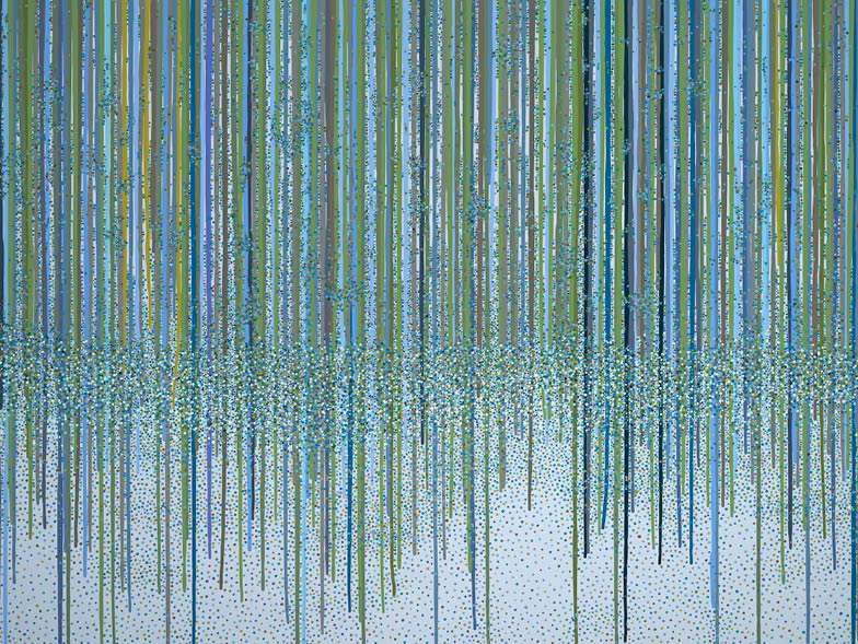
What were you drawing on for the painting titles Solitude, Hope, Myth, and Time? Why did you choose to title the series Color but title the actual paintings with much more abstract ideas?
There’s a simple explanation. For a long time, I had no name for this series of work. I had been in a show called ColorRhythms and would refer to the series of paintings using that name, but it didn’t stick. Then I started a series of work with minimal color; the paintings were almost black and white. People would ask me if I did other works that were in color. I began to refer to the group of paintings as the Color series. The titles for my paintings come to me as I paint. They come from a feeling that I am getting from the work. I prefer short titles that engage the viewer and avoid describing the painting.
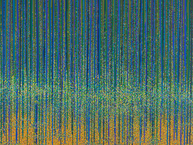
It looks like the Color series spans at least seven years. Do you intend to revisit the series every so often?
Yes, if I get an idea for a painting that fits this series, I will work on it again. I enjoy working on several series at the same time. It gives me time to problem solve and keeps things interesting.
Tell us about another of your interestingly titled series, Obsession. Is it inspired by your own obsessions?
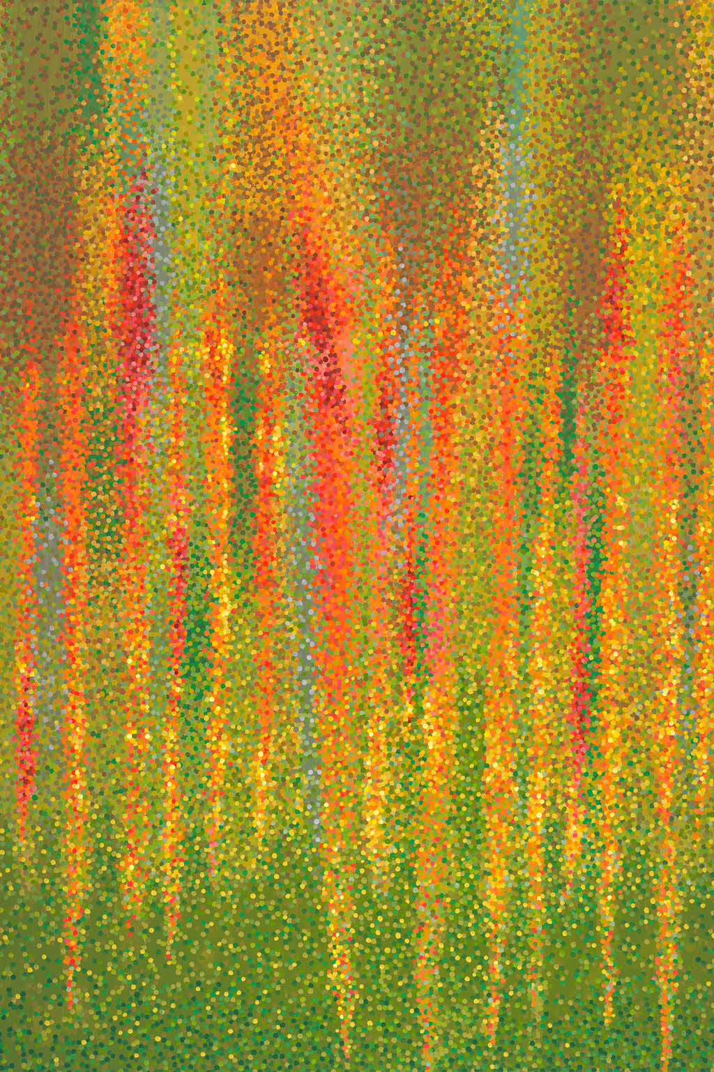
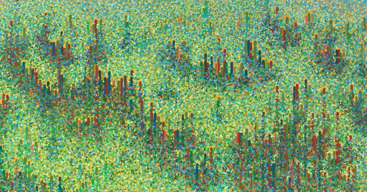
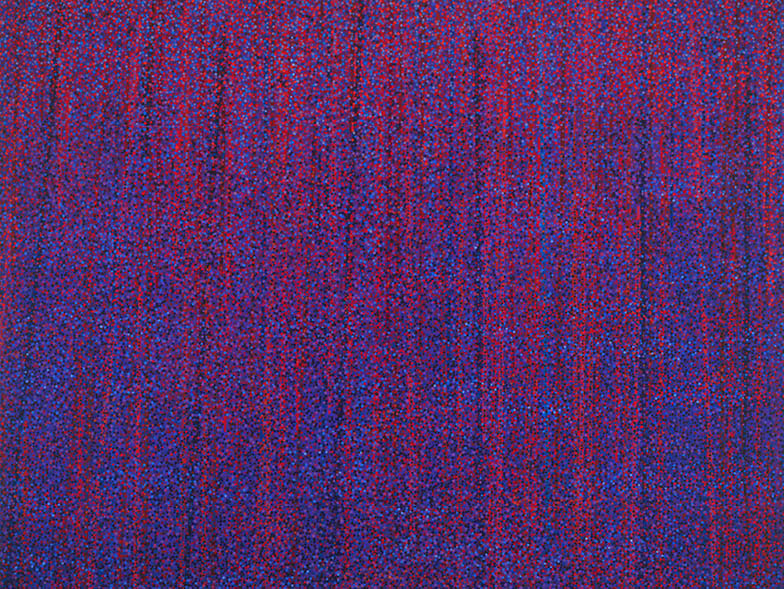
That series came about because I was repeatedly asked at art openings how many dots were in my paintings. It was the kind of question someone asks when he or she wants to start a conversation, but it happened so often I started to think there must be more to it. I decided to develop a body of work in which I counted how many dots it took to create the work. I used a circle stamper with ink and drew hash marks with graphite to keep count. The total number of dots is the title of each work, such as 1849.
Small circles and dots seem to play into a few different series. What is the reason?
It started with my interest in pointillism. I began to explore different ways of making dots, and I studied other cultures that used them in art. Aboriginal, Indian, Middle Eastern, and Asian art all utilize patterns of dots. The different series are a result of this exploration. It’s interesting to note that my last name Kolo in Polish means wheel and that the Kolo dance popular in several cultures is performed in a circle.
Which artists or designers do you admire?
There’s an eclectic group of artists that I admire. The obvious choice is Seurat. After I started working in a pointillist style, I discovered the abstract pointillist works of Andrew Forge. While living in New York, Andy Warhol was a large presence in the city’s art scene. I worked down the block from his Interview magazine offices, and I often saw him walking down the street at lunchtime. He influenced me in the way he changed people’s perception of art. Milton Glaser is a favorite graphic designer of mine. Fortunately, I had the opportunity to take a class of his at the School of Visual Arts. He had a wonderful way of getting his students to think outside the box. Another artist associated with the School of Visual Arts was Keith Haring. We attended the college at the same time, and I witnessed the birth of the graffiti art scene and his popularity firsthand. There are many other artists I admire: Yayoi Kusama, Monet, van Gogh, Georgia O’Keeffe, Jean Michel Basquiat, and David Hockney, to name a few.
What is your motivation to make art?
My motivation has changed over the years. Currently, I find the process of creating to be so enjoyable. I love being in the studio and getting lost in a painting. Hours will go by and feel like minutes. It’s satisfying to solve creative problems, and it’s rewarding to create a unique work of art.
Describe your studio. What senses are evoked while you work?
My studio is in Venice, California. It has French doors along one side that provide natural light and access to the natural beauty of the landscape, which inspire me. There’s enough room for me to have several projects set up so I can work on them at the same time. Some days, I can pick up that wonderful salty Pacific Ocean smell from the beach about six blocks away. It’s generally quiet except for the sound of my radio. A voice or music in the room settles me into the mood to work.
What does your life look like outside of your career?
I have a wonderful husband and three black cats. My husband and I both have busy schedules but find time on the weekends to hike in the local mountains or walk on the beach. Occasionally, we go to the theater. We enjoy traveling and plan on going to Italy to visit Rome and Naples. We are friends with some very creative people—painters, designers, illustrators, photographers, and filmmakers—which keeps life interesting.
For more info, visit barbarakolo.com.