A Dream Home in Portland
Interview with Jessica Hansen
Photography by Madeline Tolle
Jessica Hansen, founder of Tandem Design, knew the minute she stepped into this 1961 house in Portland, Oregon, that it was meant to be hers.
Tell us about Tandem Design:
We are a small, full-service firm focusing on interior remodels. We partner with our clients, many of whom are creative in their own right, on both their personal homes and unique office spaces. Our specialty is livable interiors that push design boundaries with the goal of giving finished results that match the dynamism of the clients themselves.
What did your journey to interior designer look like?
I was a wardrobe stylist for many years and loved my job, but the required travel took a toll, especially after I became a parent. Interior design started as a side hustle that I could do closer to home while still using my creative abilities. Over the last decade, there’s been a shift toward more interior projects and fewer styling jobs. Now I’m almost exclusively focused on Tandem Design. My twenty-five-year-old self would never have imagined it, but this second career has allowed me to have a true work-life balance so I can have time for both family and friends. It has been such a gift.
What type of projects resonate with you?
I’m most attracted to projects that transform not only spaces but also the way people live and work within them. We have multiple clients who reach out months or even years later to say how grateful they are. Being able to change people’s day-to-day lives feels very rewarding.
How quickly did you realize the Portland house was your home?
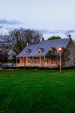
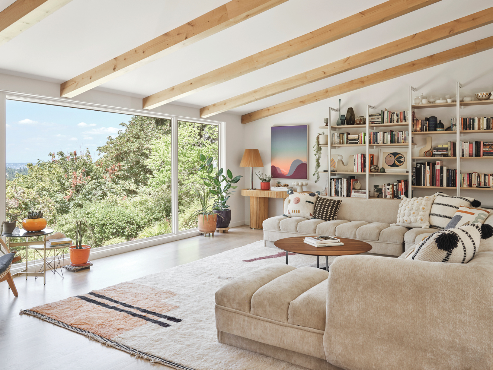
I knew this was absolutely my house the moment I walked in. It’s 4,700 square feet on a 0.3-acre lot with views of Mount St. Helens. It has four bedrooms and four and a half baths with a walkout basement. It wasn’t going to be available to us for a year, though, so I spent six months looking for other houses to get my family settled sooner. But nothing else compared to its potential or location. I couldn’t stop thinking about it.
What was working in the house, and what did you immediately know you’d change?
The house is situated on a hillside that had already been terraced and had beautiful, established landscaping with a stunning view. But inside, it was separated into a lot of small rooms that were all very dark. I knew I wanted to connect the main living spaces, reconfigure the primary bath, and, most importantly, flood the home with light. My team and I ended up gutting it and removing the walls from the main floor.
What would you consider to be the hub of your home? How did this inform your design choices?
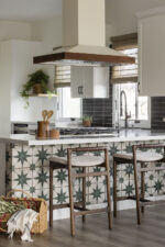
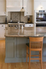
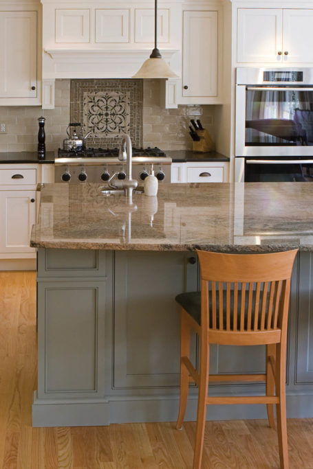
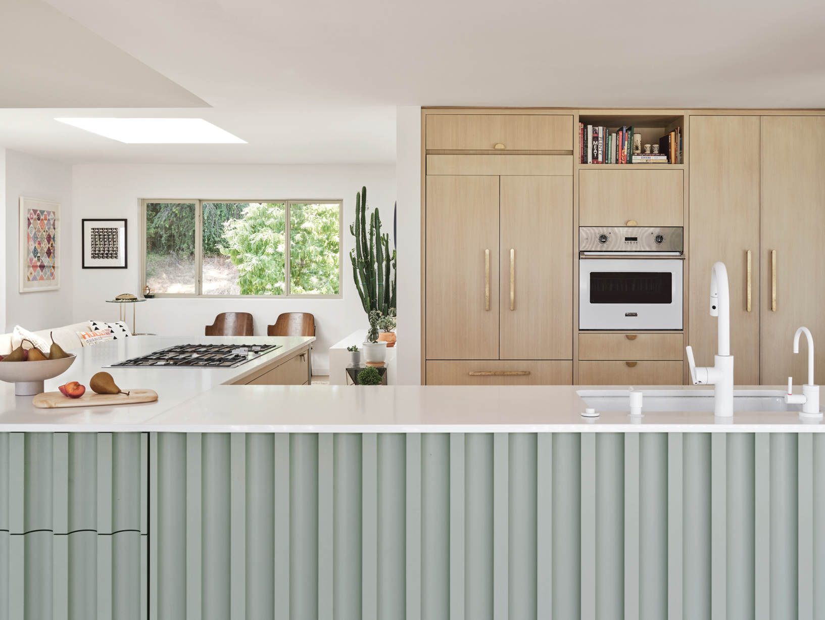
The hub of most homes is the kitchen, and it’s no different at my place. We spent a lot of time thinking through how the kitchen would connect with the other living spaces as well as with the outside deck. I came up with the concept of a floating kitchen that lives in the center of the home, which gives us a multiuse space where we can cook, oversee the kids’ projects, and entertain indoors and out with a 360-degree visual.
Will you talk about some of the artistic choices in the kitchen?
With the floating kitchen concept, there is no backsplash, so I wanted to inject texture and pattern where I could. We tiled one side of the kitchen island and created a fluted detail on the other side and on the end caps to add some dimension. The hardware also helps; typically, I’m a big fan of integrated pulls, but I added half-moon brass pulls to break up all the wood cabinetry.
My philosophy is that any cabinetry below waist level should be a drawer that pulls out; doors and shelves at this level just aren’t practical. I’m not the biggest fan of lazy Susans but wanted to utilize the corners as much as possible. So instead, we installed drawers on the back side of the kitchen island that take advantage of every inch.

How would you describe the overall style of the home?
The house is a midcentury daylight ranch, and I wanted to stay true to that era. But I didn’t confine myself to one particular style. I’ve been attracted to midcentury since the beginning of my design career but have become more drawn to postmodernism and brutalism as of late. I think these styles can marry together to create a layered and engaging design. How important was preserving the original materials in the home? The home had been remodeled sometime in the ’90s, with most of the original details stripped, so preserving what was left was a main goal of mine. The stone on the fireplace is a perfect example of this; you can see this same stone in many houses in the neighborhood. When my team and I took the walls down between the rooms, the fireplace had brick on one side and the original stone on the other. We spent a lot of time sourcing stone that would match the original and creating a cohesive double-sided fireplace that connects the spaces. The materials in the bathrooms are so luxurious.
What is your philosophy when it comes to bathroom design?
It’s all about carefully selecting hero materials and pairing them with more economical choices. We sourced a marble remnant for the primary bath sinks and saved a lot of money there. The other hero in this space is the Popham Design tile in the shower, which creates a huge impact. For the guest bathroom, we wrapped the bathtub in marble that had sat in a marble yard for many years, so we were able to get it for a steal. In the kids’ bath, the standout is the incredible Ann Sacks wall tile. And for the powder room, the obvious hero is the pink Concrete Collaborative tile. This one packs a lot of personality into a small space. We also used a cost-effective, neutral tile throughout these bathrooms and in the kitchen, which helps tie the spaces together and create a through line for the design.
What is your best advice for making design or furniture decisions?
With furniture, I think the biggest issue is that people often rush into it and make rash decisions. It’s important to build your collection over time; you should layer what you already have and love instead of wasting money to fill a space quickly. Sometimes it’s best to sit in a half-finished room and wait for the perfect piece that will travel with you no matter where you live. And if you experience analysis paralysis, reach out to the professionals! At Tandem Design, we truly believe interior design is for everyone and will work with clients on projects big and small. Never be afraid to ask for help.
For more info, visit tandemdesigninteriors.com


