


Tailored Tudor: Summer Thornton Design
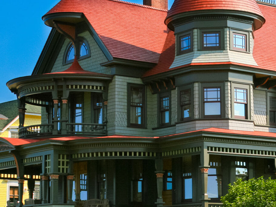
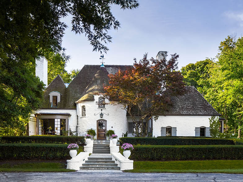
Built in the 1930s by architect Jerome Robert Cerny, this eye-catching French Tudor home nestled in a country club in Bloomington, Illinois, seems like it was transported right out of fairy tale lore. However, the inside had to be completely recreated to suit the tastes of its owner, a thirtysomething bachelor who had been eyeing the home since he was a child. Chicago-based interior designer Summer Thornton explains how she modernized the home while holding on to its traditional appeal.
Although your design firm is based in Chicago you work on projects nationwide. Do you find that your approach to design is influenced by the change of cities?
My work is focused on putting a fresh spin on traditional design. I’m definitely influenced by the location of a home aswell—that’s what makes it fun for me. The variations in light, landscape, architecture, and culture make it fun to work in different cities.
Chicago is my home and where we launched our firm; we get so many word-of-mouth referrals here that it would be hard to leave. We also have many design projects in Chicago. But I love working all over the country because it allows for different styles—in addition to those in Chicago, we currently have in-progress projects in Naples, Florida; Dallas, Texas; and Telluride, Colorado.
What’s the most enjoyable phase of a design project: the collaboration with the clients, the work itself, or seeing the finished project?
For me, the most enjoyable part is all about the initial creative concept. I typically create a narrative story—a little fantasy world—of how the owners might live in the home. It’s exaggerated and fantastical, but it allows my mind to come up with new designs that represent the clients in the very best way. It captures their tastes, their likes, and their styles, but in a way that’s elevated beyond what they could do on their own.
I also love a final reveal. Although I can visualize the outcome in my mind long before the pieces come together, some clients don’t have a full grasp of the final look until they walk through the door after everything is completed. Many clients cry because they’re so happy with the end result.
Tell us more about how this French Tudor project came together. What was the owner’s vision?
This is certainly one of those homes that causes everyone to slow down a little bit as they drive by—it truly does feel like it is out of a fairy tale because it is so charming. In fact, my client had said that he’d wanted to live in the house for as long as he could remember. He was in his thirties when he bought the home in 2012, so he wanted something that felt younger and more streamlined. He wanted guidance on how to make the kitchen more usable and how to brighten the home. He also had great ideas of his own; the one real, distinct vision he had was a monochromatic, muted palette—blacks, whites, and grays—which is unusual for our firm. Typically, I design with a lot of colors and patterns, so this was an exercise in restraint, for sure. But it fit the owner’s personality well since it was more masculine, simple, and tailored.
Sum up the theme behind this project in a couple of sentences. How did you orchestrate this theme throughout the space?
If I had to put a theme on it, I would call it modern country club gentleman. The design is traditional at its core, well tailored, and refined. It has history and pedigree. There’s patina in the finishes, but its modernity is that it isn’t pretentious or too serious—it feels fresher.
We kept going back to the word honest when working on this project. Is this material natural? Will it look better with age? Is it simple? Is it clean? Is it straightforward? Is it honest? If it ever felt contrived, forced, or inauthentic, we moved toward something more honest, natural, and real.
The house was last updated in the 1980s. Was it difficult to keep the classic 1930s Tudor aesthetic while introducing fresh and contemporary updates?
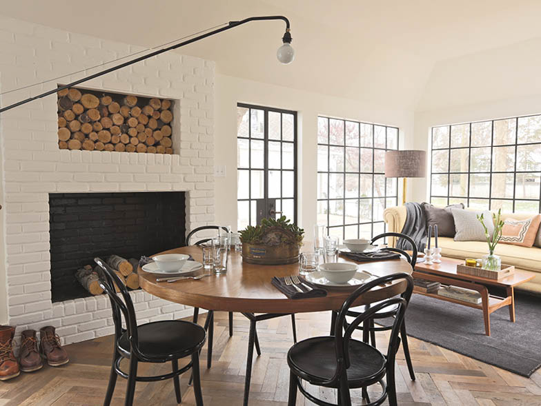
The historic nature of the home and its charm were so endearing, but we did want to make the interior more livable, so the renovation ended up being pretty substantial. Because it hadn’t been updated in thirty years, it didn’t feel fresh and current. The popcorn ceilings, pink carpet, swagged curtains, and Sherle Wagner sinks gave it personality, but, unfortunately, these details felt too formal and left the home feeling dated. We gutted everything except the upstairs parquet floor; every other wall, floor, and ceiling was removed, and all the wiring and plumbing was updated. We opened up the kitchen by removing a butler’s pantry and enclosing a porch, which allowed the client to have a breakfast table and a sofa to help him relax while drinking his morning coffee.
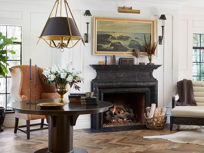
But we very intentionally did not want it to feel like a new construction home on the inside; we wanted it to feel lived-in and timeless. To preserve the historical feel, we incorporated details like steel windows and marble mantels, and we imported a lot of antique and vintage materials, like the weathered herringbone antique floors imported from France. We also incorporated furniture that was a modern twist on traditionalism—cleaner lines, some modernity, and a mix of eras (from the 1940s, 1950s, and 1960s) and, of course, new pieces. Altogether, it feels agelessly curated.
How did the lush greenery on the property factor into the design decisions you made to the interior of the house?
The front of the home is set back on the property, with a long circle driveway that is about sixty yards from the street and the golf course. In the back, we designed a formal English garden, complete with boxwood hedges, yews, and English roses. On each side of the home, there are beautiful, mature, eighty-year-old trees. The views are beautiful in all directions, and there are no privacy issues, so we chose not to use curtains in the home. It felt cleaner and more modern, which fit the homeowner and allowed more light in. Plus, it kept the beautiful views from ever being obstructed.
Speaking of light, the house features abundant lighting, thanks to a lot of windows that let in natural light, as well as some one-of-a-kind light fixtures. What inspired your lighting choices?
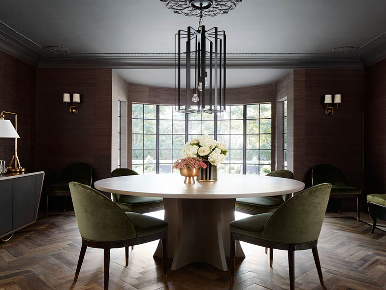
Great light is critical to living well. Most spaces were intentionally made very bright and airy for daytime use. We brought in as much natural light as we could through steel-paned windows and doors, but for evening, we found a lot of great decorative fixtures as well. Many play with scale—the exaggeratedly tall sconces and the tall, thin steel fixture in the dining room are great examples. They create a mood and give the space a little quirkiness so that it feels younger and fresher.
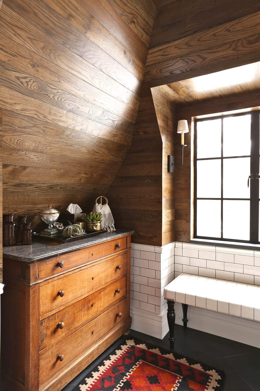
Wood is also featured prominently throughout the house, and is often paired with white tile or metal in places. What effect does that combination create?
Wood tones really help a space feel cozy and comforting. They have variation in the hues and grains, nice texture, and some subtle patterns, so I used them throughout this home to add some depth to the design that had a more limited color palette. White tile was a great offset because it helped bounce light and keep the spaces bright and clean. There’s a lot of custom craftsmanship in the home overall. The kitchen cabinets are one-of-a-kind solid walnut with solid brass surrounds and pulls. To give it a sense of age, we left the brass unlacquered so it has a little natural tarnish and variation to the metal. Other custom pieces are the master bathroom vanity and shower surrounds—both are made of steel, which has been treated like gunmetal (blued) so it wouldn’t
rust. The steel-paned windows and doors are other custom pieces that really make the home; they are not only gorgeous, but also truly handmade—just like they would have been one hundred years ago.
Did the home’s unique roof shape pose any design dilemmas for you?
The house has a really unique slate roof that creates visible rooflines in the bedrooms and the baths upstairs. Some might see it as a flaw, but I saw it as a bit of the home’s charm. Rather than hide it, we embraced it and even highlighted it in some cases—for example, the finished wood ceiling in the master bathroom showcases the shape of the roofline in a unique way.
Where did you find some of the distinctive furnishings?
We went with the client to Argentina, as a dual vacation-shopping adventure. Argentina has great antiques due to its French and Spanish ties, and it has one of the world’s largest flea markets in the San Telmo neighborhood of Buenos Aires. My husband and the client are good friends, so we asked him if he wanted to join us for a trip. While we were there, we shopped and bought a lot of great accessories and art that you can see throughout the interior, like the top hat, burl box, and rugs.
How did the client react to the design decisions?
He was really a dream client. It was a collaborative effort, but 99 percent of the time, he trusted our recommendations and said, “Let’s do it” without too much debate. In fact, on many occasions, if he had questions, he would say, “If I’m messing up something, tell me. I don’t want to meddle with it and ruin it.” He didn’t, and the end result was spectacular.
This house was also the childhood home of the owner’s future wife. What did she think of the renovation?
Our client was introduced to the prior homeowner’s daughter after the sale of the house was complete. They hit it off, began dating, and got married about two years later (at the country club across the street). So she moved back into her childhood home after it was renovated. She is a sweetheart and has been very supportive. I’m sure part of her was torn to see her childhood home literally taken down to the studs, but she does love the final result.
What design risks did you take with this project?
Some of the risks that I think really paid off were the mixture of wood, metal, and marble finishes in the kitchen. In most cases, people want everything to match—the same stone on both the island and the wall; the same metal in the hardware, shelves, and stove; the same wood in the cabinetry and the island—but I don’t believe in matched sets.
Looking back, what would you say is your favorite design element of the house?
It’s so hard to pick just one, but I love the kitchen and breakfast area. We transformed that space so dramatically by converting a three-season screened porch into an interior space, adding a fireplace, and removing a butler’s pantry. We also added the brick surrounds flanking the La Cornue range for some visual appeal and to hide the hood. I love the idea of people sitting by the fire and enjoying the view of the garden while they have breakfast on a cool morning.
For more info, visit summerthorntondesign.com