Design that Defies the Status Quo
Interview with Ginger Curtis
Photography by Matti Gresham
Designer Ginger Curtis, winner of the 2021 HGTV Designer of the Year Award and author of the book Beauty by Design: Refreshing Spaces Inspired by What Matters Most, built her firm, Urbanology Designs, at one of the toughest points of her life.
She shares how she used color and the unexpected to dramatically transform a Craftsman Tudor-style home in the Dallas suburbs.
How did you get started in design?
I was at the tail end of chemotherapy for an aggressive cancer that had spread. My treatment lasted for eighteen months, and it started right after my daughter finished her own treatment for leukemia. It was a lot—I’d never had to fight so hard for something in my life.
While all this was happening, I decided to do a gut renovation to my home’s kitchen, floors, and popcorn ceilings. A lot of people thought I was crazy, but the project actually put wind in my sails and gave me something to focus on instead of my own pain and misery. The redesign of my home also allowed me to enjoy it as a refuge and a place of peace.
My passion for design really grew out of this season of my life. It was during my greatest battle that I discovered a home can be a place that refuels and inspires you. Everyone deserves a beautiful home; it affects how we live and function. That’s why, after I came out of chemo in 2015, I launched Urbanology Designs—so I could help others achieve this too.
What did you do before you launched your firm?
I used to design and build furniture for local artisan shops, which was my first introduction to the design world. Then I got married and had five kids. But I found myself longing to do something more from a business and creative perspective. I didn’t know it then, of course. At the time I was just focused on designing functional and beautiful furniture.
How would you describe your firm’s design style?
Our motto is simple: defy the status quo. We aim to design spaces that are beautiful, impactful, and long-lasting so they won’t trend out. The owners of the Craftsman Tudor home, a dynamic couple with two young children, had a vision that embodied this perfectly. They commissioned us to design the entry hall, study, and living room of their house in Greenway Parks (a family neighborhood in Dallas), asking for a look that was weird, funky, and saturated with color.

The study has a cozy, yet edgy feel. What was your inspiration for this room?
We wanted it to feel storied and lived-in instead of brand new. So we utilized a lot of deep greens, golds, and browns to create a room that’s moody without being too dark since it also needed to be a practical working space. We brought in unique textures and shapes to elevate the look in a relaxed, casual way. The white-oak desk adds unexpected flair, and the vibrant yellow-green chair pops against the dark wall color. Because they love art, we also mixed in some modern art pieces. I will say, though, that one of my favorite pieces in the space is something the clients already owned: a leather settee with a perfect buttery color.
The living room has an elevated design but is still family friendly. How did you achieve this?
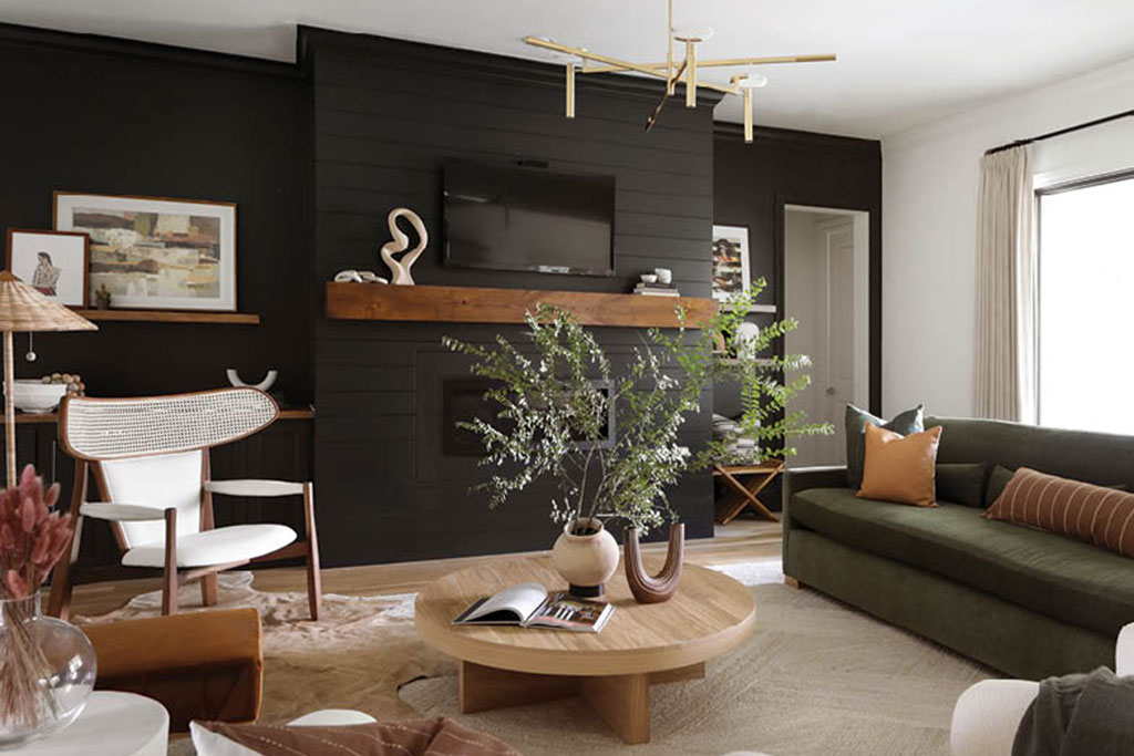
Since this is where the family spends most of its time, we tried to balance beauty and practicality. We selected a mossy-green performance fabric for the sofa because it’s very forgiving and looks beautiful against the black wall. The white chairs are off-limits to the children, but even so, they are well protected. The quirky accent rug is basically indestructible, and the large textured jute rug is also very durable.
We chose contrasting black and white walls to create two different experiences depending on where you stand in the room; you can see the sofa against two different backdrops. The chair feels a little midcentury modern, and the rattan lampshade also brings in a retro vibe. We paired them with organic pieces like the comfy sofa and the coffee table. The mix of styles and textures works to create a distinctive mood in the room.
How did you transform the fireplace wall in the living room?
The clients wanted to change that wall, which was covered in white, farmhouse-style shiplap. Because we didn’t want to spend a lot of money on renovating the wall itself, we simply painted it black. We also added a dark mantel and installed a floating shelf for artwork. These simple changes were a very effective way to modernize the wall, and they also helped to hide a flat-screen TV.
Would you describe the design details you added to the hallway?
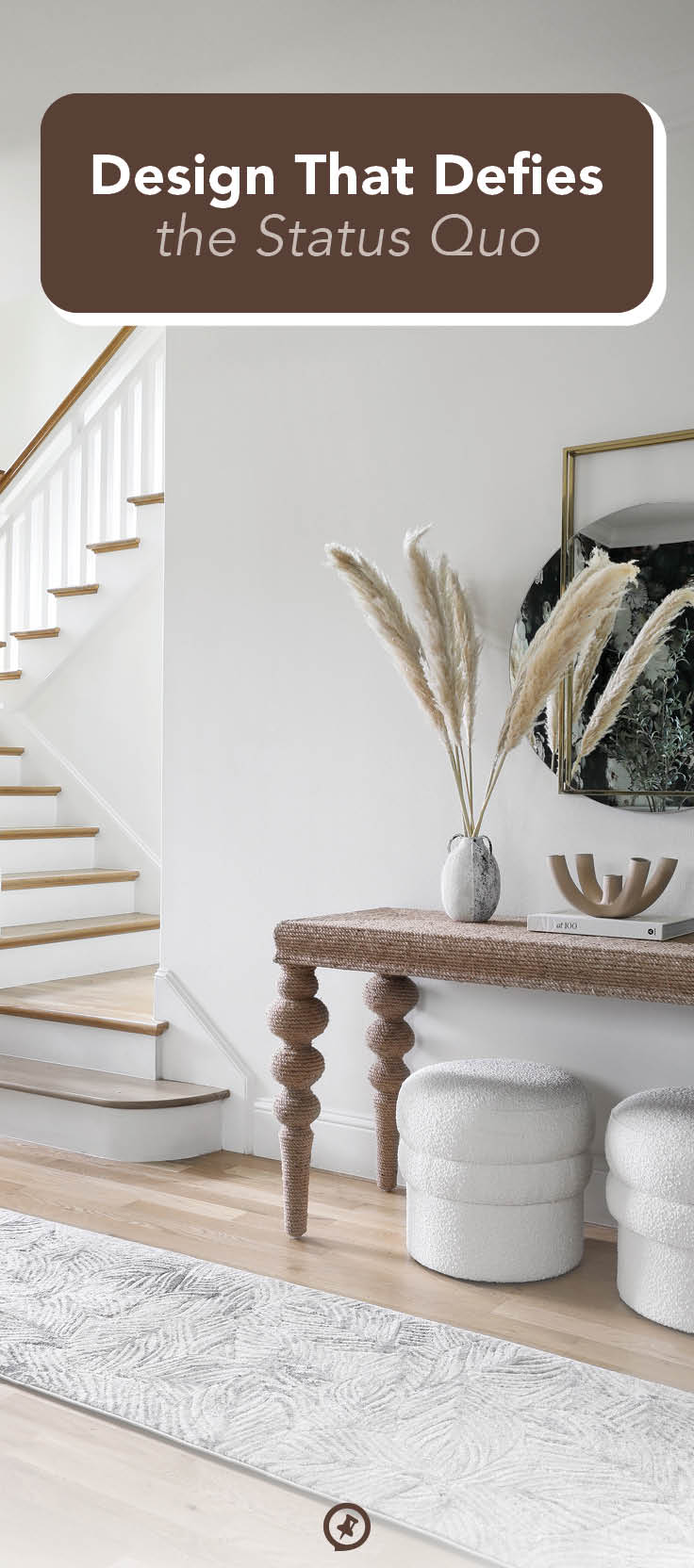
The hallway was an opportunity to create something slightly more feminine. The finishes in the entry were already new and bright, so we added lighting, artwork, a console table, and some decorative items. The table is constructed from a woven fiber that gives it texture, and we placed some modern, chunky poufs underneath it. Now when you move from space to space in the home, from the entryway to the living room to the study, there is a juxtaposition from light and organic to dark and moody. This home is a perfect example of how you can mix styles beautifully when you plan a project well.
I truly love the design of this home. We were looking to create spaces that have soul, and our clients wanted the same thing, so it was a match made in heaven.
For more info, visit urbanologydesigns.com


