


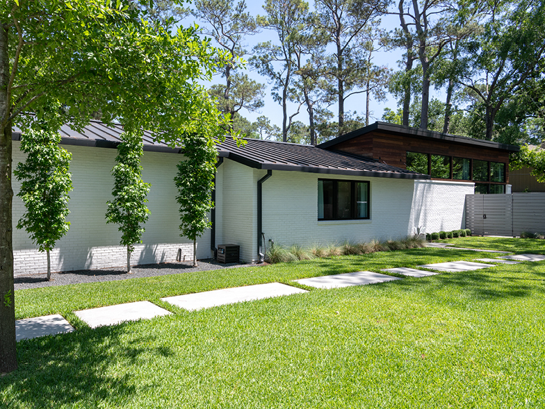
Houston, We Have a Rebuild
Designer Sara Hillery transformed a Houston home into a spacious and airy abode for a creative couple and their three children.
What did this home look like when your clients bought it?
The house had a similar basic footprint, including the atrium. When the clients sent photos of the house to me, I thought it looked amazing, but, unfortunately, it wasn’t in good shape structurally. The couple began with the idea of preserving what was already there and adding on, but we ended up having to take the house down to the studs and reconstruct it.
What did the rebuild entail?
It ended up being a blessing in disguise. These are creative clients who can imagine the potential in a space. We decided to add 1,000 feet to the house’s footprint (including the living room and breakfast areas) and raise the ceilings to make it feel lighter and more spacious. The rebuild also allowed the clients and us to work together closely to ensure that every element—from the wall decor to the built-in walnut storage components throughout the house—contributed to the feeling of intentionality and playfulness.
Was it inspired by any particular architect or era?
The original home reflected midcentury design, and we tried to honor that spirit. The clients and I spent a lot of time searching for images of midcentury homes built during that era; they were also active on Pinterest, collecting ideas they liked and wanted to incorporate.
What part of the rebuild had the maximum “wow” factor?
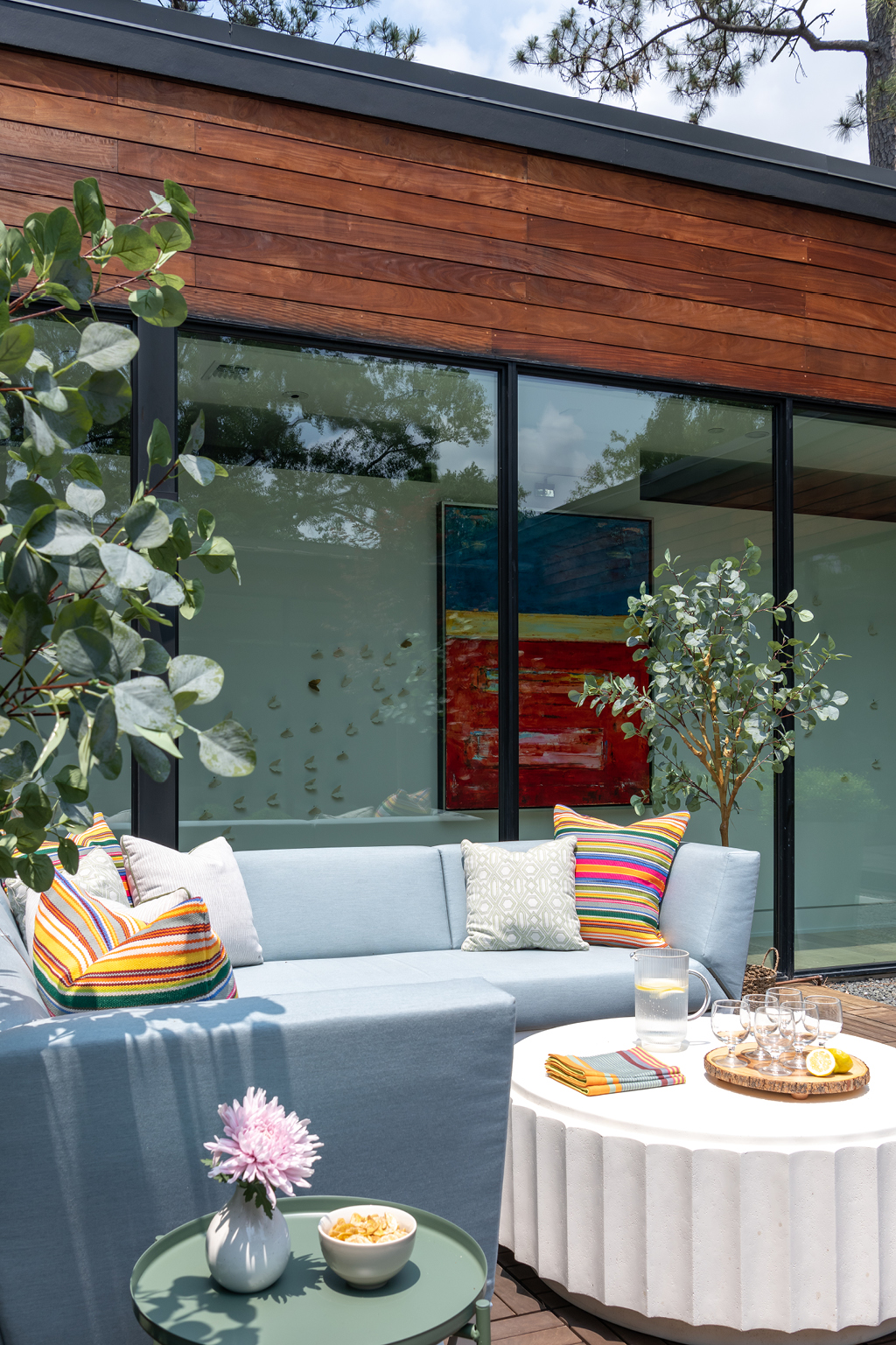
For me, it’s the bump out we created for the breakfast room. The glass on two sides of the room, the light and raised ceiling, and the views of trees make the space feel open yet private.
How did you make sure the breakfast room and living room spaces would segue easily into each other?
The living room, breakfast room, kitchen, and playroom are all essentially one open space, but they’re clearly delineated through distinct yet complementary colors. We chose furnishings and accents that we could move and interchange from room to room.
How did you incorporate color into the rest of the house?
We wanted the house to feel chic yet approachable for a young family. To get guidance on the color palette, I asked one of my clients what her favorite colors were and incorporated blues, pinks, purples, and greens in various shades. Some of the spaces, especially those that the children would be spending much of their time in, have more color, while others, such as the couple’s bedroom, are more calming and neutral.
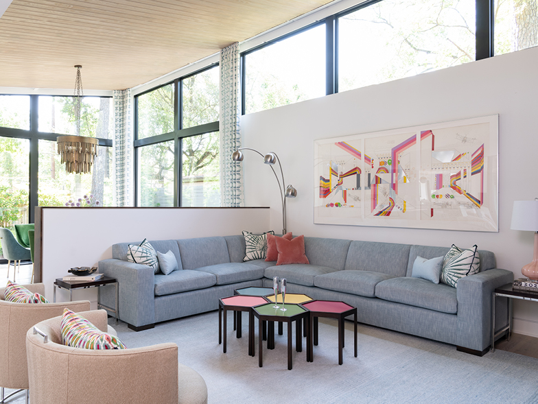
The art in the living room matches the hexagon coffee tables so perfectly. Which came first? What vibe did you want for that room?
The art, which was found at High Point Market in North Carolina, came first. This is the adults’ living room, but we knew it needed to be kid friendly as well as pet friendly for the family dog. I added more color by re-covering the sofa from the couple’s last house with a sturdy, blue, indoor-outdoor fabric and bringing in the hexagonal tables, which can be moved around and taken apart as necessary. Everyone loves that space for watching movies! The room is a continuation of the house’s flexible and comfy yet classy vibe.
Will you talk about the dining room table and what makes it special?
The eye-catching dining room table has a touch of family history. It was originally a root table that belonged to one of the clients’ parents and was used as a coffee table. I added a custom brass-nickel base and a glass top to make it functional without feeling overly formal.
What design element did you start with in the kitchen? Is it easier or more difficult to design when the floor plan is so open?
We began with the island since we knew we wanted it to serve lots of purposes. We designed it so that it had storage space, a place to eat, and cooking surfaces, and we created one part at kids’ height so that they could help prep and make things. There’s also a hidden charging station and even a tucked-away vacuum.
It’s more difficult when the floor plan is so open because you have to consider everything in unison. We love playing with textures and materials, so it’s a fun challenge carving out spaces within a more open floor plan. Constructing half walls, choosing a distinctive backsplash, and creating rooms within rooms through design aesthetics make each space feel separate, yet the family still feels connected.
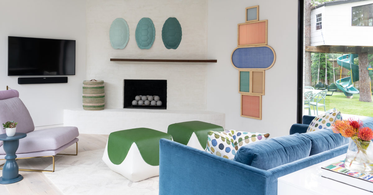
Do the clients have a favorite room?
The children’s playroom is playful and whimsical and colorful, and there are a lot of custom-made and personalized elements. We painted tortoise shells and installed Hayley Sheldon woven art, and this helps bring color and vibrancy to the bright, white room. The custom-made poufs and blue-velvet sofa demonstrate how design for a family can be playful, functional, and chic all at the same time.
How is designing kids’ rooms different from navigating the design style of an adult?
Young kids need ample space to play, a fact we kept in mind when designing their rooms. When we design for a child, we know that we want them to love the room they are in, but that they will also be growing and changing; the room should give them space to do that (literally and figuratively). Adults don’t tend to change the way they use a space over time.
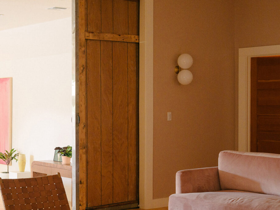
What did you envision for the couple’s bedroom?
We wanted to create a serene space that relies on clean lines and emphasizes functionality for this busy couple with active personal and professional lives. They also love nature, so we tried to incorporate elements that would evoke this: limestone, walnut-wood detailing around the tub in the adjoining bathroom, and a custom-made wood-paneled sliding door.
What were your goals for the outdoor area?
We wanted to create a welcoming, usable space for the whole family. The atrium is perfect for family hangouts and entertaining friends, while the backyard was designed especially with three active kids in mind. It has a treehouse, a sports court, and even a putt-putt area.
How do you feel about design rules?
I don’t believe that design has to be “just so,” and I also believe in pushing boundaries a bit. The clients originally wanted the house to be gray and beige, but I encouraged them to add color. One compelling reason was that I knew this would be a house with young kids and all their toys. Color makes it easier for all those toys to blend in instead of stick out.
What did you find most challenging about this project?
The most challenging aspect was probably the cabinetry details. We wanted the walnut cabinetry to feel seamless—more like artwork than a design feature—so this had to be very intentional. In addition, the house’s open floor plan means that there aren’t many walls, but this couple loves art. So it was a challenge to incorporate art into those that were available.
What do you feel worked perfectly in this rebuild?
Creating distinctive spaces within the larger open areas of the house was my favorite part. There are always nooks and crannies to consider, and I’m proud of how we were able to make everything work together in perfect unison.
For more info, visit sarahillery.com